After 10 years navigating the highs and lows of the crypto world, Kyle Samani, co-founder of Multicoin Capital, has announced he is stepping down as managing partner.
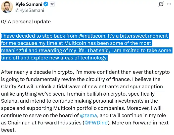
In a heartfelt post on Wednesday, Samani described the moment as “bittersweet” and said he plans to take some time off to explore new areas of technology.
He revealed that his next ventures will include AI, robotics, and other emerging technologies, signaling a shift from his day-to-day role in crypto investing.
A Strong Belief in Crypto Remains
Even as he steps away from managing Multicoin, Samani expressed optimism about the future of cryptocurrency.
“I am more confident than ever that crypto is going to fundamentally rewire the circuitry of finance,” he said, pointing to the Clarity Act as a key catalyst that could drive a surge in adoption and attract new participants to the market.
Samani highlighted Solana as a standout project and confirmed he will continue making personal investments in crypto while supporting Multicoin’s existing portfolio companies.
Mixed Messages on Web3 and Ethereum
Interestingly, some of Samani’s previous statements appear to conflict with his current enthusiasm.


A reportedly deleted X post suggested he had grown disillusioned with web3 and decentralized apps, saying: “Crypto is just fundamentally not as interesting as many crypto enthusiasts wanted. Myself included.”
He has also criticized Bitcoin and Ethereum in the past, citing dissatisfaction with Ethereum’s approach to scaling as a key reason for losing faith in the platform, despite having called Ethereum his “entry into crypto” back in 2016.
From Solana Early Investor to $5.9 Billion Firm
Samani first encountered Solana shortly after founding Multicoin in May 2017.
The firm went on to back some of Solana’s earliest investment rounds in 2018, a decision that turned out to be highly profitable.
By May 2025, Multicoin was managing $5.9 billion in assets, making it one of the most prominent crypto investment firms in the world.
Samani’s strategic early bets on projects like Solana helped solidify the firm’s position in the industry.
Looking Ahead: AI, Robotics, and Longevity
In a letter co-written with co-founder Tushar Jain, Samani outlined his next chapter, which includes exploring technologies outside of crypto, such as artificial intelligence, longevity research, and robotics.
Multicoin, meanwhile, reassured investors that its commitment to crypto remains strong:
“In our view, crypto is at a critical inflection point — on the eve of regulatory clarity, infrastructure maturity, and mainstream adoption — where it can meaningfully disrupt global financial and capital markets.”
A Pivotal Moment for Crypto and Multicoin
Samani’s departure marks the end of a defining era for Multicoin, but it also highlights the evolving nature of the tech and investment landscape.
While he moves toward new horizons, the firm continues to navigate crypto’s regulatory and technological shifts, positioning itself for the next wave of growth.
For Samani, the next chapter promises a blend of curiosity, experimentation, and high-stakes innovation — from AI labs to robotics prototypes — while still keeping one foot firmly in the world of cryptocurrency investments.